CFT GROUP CONTINUES TO GROW: HERE IS THE NEW OFFICE PAVILION
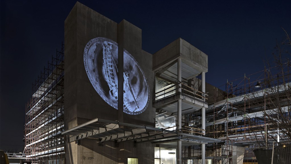
September 2019 marked an important milestone in the growth of CFT Group. In fact, the new office pavilion of the headquarters in Parma, created to take into account of the constant growth of the Group and with a particular focus on design and environmental sustainability, was inaugurated.
Professor Carlo Quintelli and architect Mariangela Valesi, respectively responsible for the concept design and the development of the project, illustrate the main features.
Professor Quintelli, what is the concept behind this new architecture?
First of all, this new architecture has been added to the existing “city” of CFT Group, which consists of manufacturing facilities, “courtyards” for logistics, lived-in spaces where a variety of production activities are carried out, both material and immaterial. This extension is therefore another section of the city, connected to the existing offices by a bridge which is home to meeting rooms and recreational spaces, corridors and staircases intended as collective spaces, the “auditorium” for conferences, the winter garden and the external terraces, the offices distributed in clearly-defined compartments. The layout maximises the north-south orientation of the building and follows the Cardo Decumanus alignment that typifies the Emilia region.
How much did the history and future vision of CFT group influence the design concept?
The aesthetic qualities of the building certainly reflect the formal value of CFT Group’s products. One only needs to look at the juxtaposition of linear, orthogonal, circular, concave and convex elements to draw parallels with the shapes of the steel components designed by the Group, both its historical and contemporary pieces. The project adopts a modernist approach made up of geometric shapes that are both outlined and well connected, according to the best tradition of Italian design, where aesthetic innovation and functional logic find the perfect balance. After all, architecture is destined to last over time, it is not a consumer product, so too are the systems designed by CFT Group.

Architect Valesi, what are the unique characteristics of the new building in terms of functionality and environmental sustainability?
The new building is arranged over three levels: the ground floor and first floor for operations, the connecting bridge, and the second floor is comprised of a total of 3,000 sqm. of executive offices, terraces and green areas that look onto the surrounding gardens. The plan is distributed along a long central axis, along which open-plan and cellular office spaces, meeting rooms and back of house areas are served by a central core. The well-being of the occupiers is placed at the heart of the scheme. Natural daylight is maximised by way of large full-height windows with motorized slatted brise soleils and internal glazed walls. The internal winter garden and atrium, with its skylight, allows light into the centre of the plan and the fenestration throughout ensures the surrounding gardens are visible from inside. A latest-generation geothermal system wall cover, high-insulation and thermal-inertia solar panels assisted by an intelligent automation system of energy efficiency, make sure the proposal is also environmentally sustainable.
What were the other qualitative aspects that defined the project?
The colour palette, for example, has been carefully assessed, considering the aesthetic identity of CFT Group’s plant product for the food industry. The result is a white, bright dominant colour on which complementary colours are grafted through the use of greys with different tonal variations for the stoneware floors, ironmongery, metal doors, windows, and cladding. Some details in stainless steel, such as the toe cap system and the handrails of the linear staircases instead of the columns of the winter garden, are a direct reference to the company’s manufacturing culture. The same furnishings are characterized by the dominant white with inserts of panels such as stainless steel satin and other components, which denote different operating levels, using the colours blue and green. The executive floor, which also needs to be representative of the company’s ethos, includes furnishings in warm and elegant tones while remaining within a formal and chromatic neutrality that distinguishes the overall image of the building. Restored old machines together with professional photography of more present day pieces by the company, only add to the aesthetic qualities of the place and complement the internal spaces and surrounding gardens.
